FEATURED POSTS


John Lewis - The Bear and Hare - 2013 Seasonal CGI Amazing coloured pencil drawings Tokyo City Symphony Luis Nieves - Baywood Red Light

24 October 2013

Creative dreaming....


Morning all,

Just a quick word from me this morning but I couldn’t not share this article with you.

Using only plain cloths, clothes, stuffed toys, and other common materials, Queenie Liao (a mother and artist) has explored a creative way of expressing what her baby boy Wengenn may dream of during his sleep.  Each photo shows a carefully thought out dream experience and is extremely well executed.  Queenie’s album is entitled “Wengenn in Wonderland” and has 100 different fairytale dreams.  Well done Queenie, you really have pushed the boundaries with this one!

Have a look for yourself and see which your favourite is and to find out more click here


Images courtesy of Google Images
Art, Creativity

21 October 2013

The Exbury Egg


The Exbury Egg is 'a temporary, energy efficient self-sustaining work space for artist Stephen Turner in the estuary of the River Beaulieu. It is a place to stay and a laboratory for studying the life of a tidal creek, a collecting and collating centre with integral storage & display areas. It will take on the patina of 730 daily tides below the water line, and 365 days of weathering by wind, rain and bleaching by the sun above'.

It is, by all accounts, the most beautiful object and must have taken countless hours of craftsmanship to create:


More of the construction process can be viewed here. Well worth a look!

Design at SoVibrant

Quote and images courtesy of http://www.exburyegg.org

18 October 2013

Blog - World Cup Qualification


For my blog, I thought I would stay topical with this week’s 'Big' news, more specifically, the football and the fact that England have only gone and managed to qualify for the World Cup Finals in Brazil, following Tuesday's 2-0 victory over Poland.

Now, before I get carried away with the success of England and start booking my tickets to the finals, which are reportedly going to cost the average England Fan somewhere in the region of £9,000, I thought I would take a look at some of the construction work that is currently being undertaken in Brazil, in preparation for the 2014 World Cup finals, primarily, the stadiums that are under Construction or Renovation.

National Stadium - Estádio Nacional Mané Garrincha (Capacity 72,788)
Artist Impression 

The stadium, (named after Brazilian Footballer Mane Garrincha who won the 1958 and 1962 World Cup with the Brazil National Team) was originally built in 1974, before being demolished in 2010 and rebuilt. The current reconstruction was designed by Brazilian Architect Oscar Neimeyer, who is also responsible for a large proportion of the National Monuments in Brasilia. The Stadium is reported to have cost somewhere in the region of US$500 Million, making it more costly per seat than the Cape Town Arena, the most costly stadium of the 2010 World Cup.

The stadium was opened 18th May 2013, with a friendly match between local sides Brasilia and Brasiliense, before Brazil played their first game in the stadium on June 15th, beating Japan 3-0.

For those of you like myself, who use Autocad, you may recognize the Estádio Nacional Mané Garrincha Stadium, as the stadium is integrated into the start up screen for Autocad 2013 and therefore appears across my screen on a daily basis.

AutoCad 2013 
The Completed Stadium
The stadium will play host to seven matches in the 2014 world cup finals

The only other stadium to play host to seven matches in the finals is the refurbished Maracana Stadium, Rio de Janeiro, over looked by the famous Art Deco statue of Jesus Christ.

In preparation for the 2014 world cup finals, this iconic football stadium, originally constructed for the 1950 World Cup and once recognised as the largest stadium in the world, hosting crowds of 200,000, has undergone a full refurbishment and renovation programme, which involved the demolition of the lower ring of seats, the construction of a new ring offering improved visibility, the expansion of the access ramps and the replacement of all seating. The stadium has also been fitted with a new roof complete with a rainwater collection system. The facade, which has been listed by the National Institute of Historical and Artistic Heritage, remains untouched. This stadium will host the 2014 World Cup Final.
Site: Maracana Stadium, Rio de Janeiro
Site: Belo Horizonte, Minas Gerais (Capacity 62,160) Status: Completed
Among the 12 venues chosen to host the 2014 Wold Cup Finals, there are a number of other stadiums currently under construction that are definitely worthy of a mention in this blog.

Site: Manaus, Amazonas (Capacity 42,374) Status: Under Construction
Estimated Cost : US$ 246Million
Artist Impression
Stadium Under Construction
Site: Natal, Rio Grande do Norte (Capacity 42,000) Status: Under Construction
Architect : Populous (Formerly HOK Sport) http://populous.com/project/estadio-das-dunas/
Estimated Cost : US$ 185Million
Artist Impression
Stadium Under Construction
Site: Sao Paulo, Sao Paulo State (Capacity 68,000) Status: Under Construction
Architect : CDCA Architects Aníbal Coutinho http://populous.com/project/estadio-das-dunas/
Estimated Cost : US$ 375Million
Artist Impression
Stadium Under Construction
So with less than 8 months until the finals begin, there are a number of impressive stadia under construction / renovation.  The stadiums, together with the South American Skill, Flair and Philosophy to Football and the renowned Brazilian Carnival atmosphere, I for one feel that this World Cup will certainly be a memorable World Cup.

Whether it is a memorable performance from England, that remains to be seen.

(All Images Courtesy of Google Images)


Steve Murray
Senior Designer


17 October 2013

Can you bank on your brand to install consumer confidence?


Hello readers,

As many of you may have noticed on the high street, Lloyds Banking Group has separated its main brand from TSB, a bank it acquired in 1995 and is due to resell next year, according to EU competition rules. Whilst both banks have had a rebrand, as they currently stand both of these banks are offering identical products which puts customers at a crossroads and begs the question, which brand do you as a customer, trust more?

TSB's branding has seen it take an approach towards local banking, focusing on serving individuals and local businesses, promising to put profits back into the local community through loans and mortgages. Its current advertising campaign boasts a return to the traditional banking of yesteryear, in a time where banks were trusted and customers interests were at the core of the bank, run for the benefit of the community. It's not hard to understand why a brand that has spent the best part of 20 years of the high street would want to distance itself from the current consumers perception of mistrust of the financial industry.


I have to say I found the advertising campaign is really engaging. I was intrigued to find out more and the juxtaposition of  two-dimensional characters and 3D computer generated imagery gives a welcoming, friendly feel.
TSB Branch - Courtesy of Google images
At first glance, the brand experience matches that of its values, with the removal of glass cashier screens in branch, and meeting rooms for customers in the back of branches, giving an altogether more personal feel. This brave venture to try and recapture trust will only work if the brand delivers it values to its customers as promised. The business values will have to be evident right to the bank's core. From the cashier to the chief executive, each will have to embrace and demonstrate their understanding of these values.

In contrast, Lloyds Bank has placed its focus on 'moments that matter' with current advertising detailing case studies of first time home buyers and new business owners. The brand itself however, remains relatively unchanged. With a tweak to the horse, a switch to using the green brand colour in isolation and a new typeface this brand has modernised, but the very fabric of what makes Lloyds Bank has remained intact. As a Lloyds customer myself, I have had mixed experiences with them and I wonder if they will in fact deliver on being there for the 'moments that matter' to their customers. In light of yet another recent scandal regarding PPI claims, I can't help but feel that Lloyds may have missed a prime opportunity at this re branding juncture, to distance itself from its past image, installing a new confidence in its customer base with a fresh approach.

Courtesy of Google images


With recent changes in the law to allow consumers to change their bank within days as opposed to weeks, banks will have no option but to try and build trust. If these two banks' new customer values are to set a precedent, it will be interesting to witness the evolution of the high-street banks and to see how they will seek consumer confidence. We will no doubt see more re brands and repositioning on the banking high-street soon, but only thorough and consistent delivery of brand values by its employees will a bank convince customers to trust them once again.

What are your thoughts on the branding of these banks? Which one do you prefer? We'd love to hear you thoughts.

Chris Cheshire
Brand & Experience Team


14 October 2013

SoVibrant at Yorkshire INSIDER Property Industry Awards


At SoVibrant we don’t often blog about our own projects, awards or whereabouts so to break the current trend in my colleagues blogging, I thought I would share an event myself and Mike attended earlier this month.

Every Year INSIDER hold a Property Industry Awards Ceremony in New Dock Hall, Leeds.  This year SoVibrant were a main sponsor of the event and we can safely say the exposure we have had through the event has been very positive.

The night started with a drinks reception, meeting our guests and catching up with others in the industry.  This is always a nice start to the evening and even better, a nice wind down to the busy day at SOV HQ.  We were greeted to the event by key speakers from INSIDER and also had the fantastic Scottish comedian Fred Macaulay as the comperé.  Unfortunately (or fortunately as some may say) our table was in the comperés line of fire so we ended up being part of the comedy quite a few times throughout the night ... amazing free advertising!

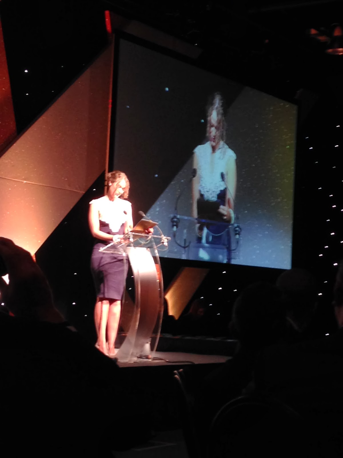
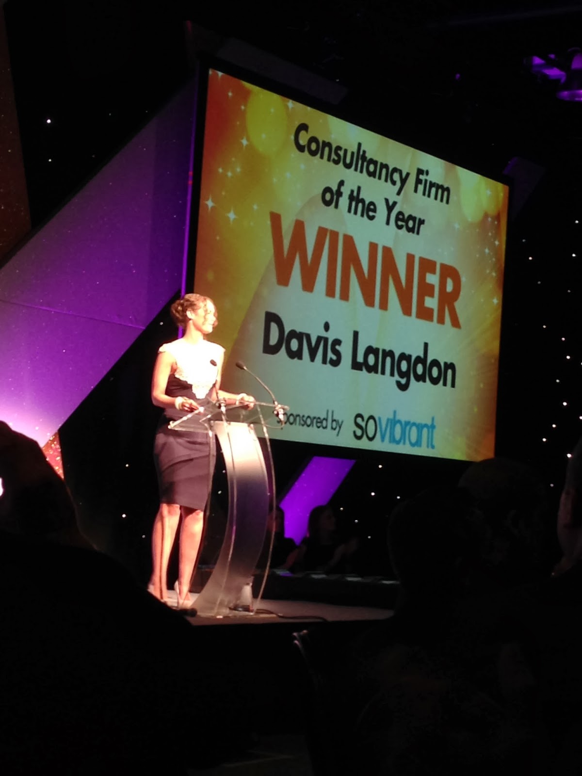
We settled into the evening with a beautiful three course meal followed on with the awards ceremony....What we had been waiting for.  We were so proud to see two of our clients, City of York Council (West Offices) and Yorkshire Building Society (Broadgate) not only be nominated but actually receive awards.  Tracy Carter from City of York Council accepted the award for Restoration and Refurbishment of the Year with West Offices and Philip Kirtlan accepted the award for Commercial Property Deal of the Year.  As a main sponsor we were also able to hand out an award for Consultancy of the Year in which Davis Langdon were the winners.  I can only describe the on stage situation as slightly daunting, but also felt a great sense of achievement in not tripping up the stage and not drinking too much vino so could pronounce the winners clearly! PHEW!

The awards continued through to the early morning however not before I personally got heckled by the comperé.  At the time this was again, a daunting situation in front of 400 industry professionals including being dragged on stage for a photo with Fred Macaulay himself! Ahh never mind, it was all fun and games and SoVibrant have most definitely made an impact in the industry in 2013.

Be sure to follow us on Twitter at SoVibrantUK for our latest news and whereabouts.


Genuinely not photoshopped! We're on the BIG screen!
 
Some of our lovely clients (left to right, Peter Hall Jones Spiral Partnership, Alison Carrick, Head Teacher at Victoria Primary School, Lee Ford, 4D Creative Media)

Gearing up to hand out the award!
 
Finally ... no more pressure!

A few drinks later ... the party continues.
The beautiful Ali Carrick
 
My Director and I


October release of INSIDER ... SoVibrant get another mention


SoVibrant, Awards

2 October 2013

iOS 7 : Making flat design mainstream


Hello readers,

As the majority of iPhone users have done in the last few weeks, I have taken the step to upgrading to iOS 7, Apple's latest rendition of its mobile user interface. My experience so far has generated mixed feelings towards this latest offering. Personally I feel it's a bit hit and miss. I can't help but feel this iteration of iOS offers more in style than substance, despite a few nice new features for iPhone users to enjoy. That being said most of these features have been enjoyed by Android users for a long time now.

Image courtesy of Google images

Having read some of the feedback on various forums, it seems that iOS7 has caused a real divide in the normally united opinions of the Apple fanbase. Many users complain that it's too simple, or that the functionality has changed too much for easy adaptation to the new design. Others say they love the way it looks and the features make it a more rounded user experience. Motion sickness issues from the interface and problems with iMessage have marked Apple's card somewhat, but for better or for worse, it has definitely got the digital world talking.

What has stood out the most is Apple's move towards flat design. Flat design first appeared as a popular design style during the Soviet era. In the same way as Swiss style design, flat design relies heavily on simplicity and a strong typographic style. Clean sans serif fonts and solid blocks of colour are king in flat design. 

Image courtesy of Google images

Apple are by no means alone in this venture. Microsoft, Ebay, Google and YouTube have all embraced this design trend. So what has caused this collective change? Many factors have been the catalyst for this transition, but there are a couple of things that stand out. 

Image courtesy of Google images

Information overload 
We live in a world where the screen in your pocket dominates all the others in your life. It wakes you up in the morning, checks the traffic, and tells you the best way to get to work. It lets you read your email during meetings, find a lunch spot, schedule a recording on your DVR, and read the day’s news before you doze off at night. With all of this information in a single place, it makes sense that the way this information is relayed back to the user  is easy to read, simple in design and intuitive in it's usability. 

Improving the User's experience
The three tech giants are moving toward flat design in their efforts to improve the overall user experience. Although flat design is not necessary the goal of any design project, it often ends up being the result. In the most simplistic terms, the more design elements you add, the busier the design will be. Gradients, shadows, patterns, and textures can bring a design to life, but too much of it can quickly clutter it up into a huge mess. Better user experience makes your users loyal and happy and increases the chance of your product succeeding.

It's time for a change
In a post Steve Jobs era Apple have a need to push forward to keep up with the times. iOS debuted in 2007 with the first iPhone, and it has changed relatively little since, visually speaking: applications shuffled around, some icon tweaking and polishing, an extra row on the iPad and iPhone 5, some nips and tucks here and there. iOS 7, by contrast, changes everything: it’s the vanguard of Apple’s decision to liquidate skeuomorphic design.

Is flat design the future?
It's impossible to say that this style of design is the future, but what is clear right now is that in a digital world where the focus is on the user's experience, this style looks like it is being adopted by increasing numbers of large technology brands. What is important to mention is that flat design is not the be all and end all in creating an effective smooth user experience, designers have been able to create user friendly interfaces for a long time, without drawing inspiration from this style.

What are your thoughts on Apple's iOS7? Do you the love or loathe the flat design trend?  We'd like to hear what you think.


Chris Cheshire
Brand and Experience Team
www.sovibrant.co.uk