FEATURED POSTS


John Lewis - The Bear and Hare - 2013 Seasonal CGI Amazing coloured pencil drawings Tokyo City Symphony Luis Nieves - Baywood Red Light

10 October 2012

YouTube's new London office - crazy or inspired?


Hot on the heels of our recent blog on the new Google offices in London, we turn our attention to YouTube's floor within the St. Giles Court development in Covent Garden.

As you might expect, the interior theme is a continuation of Penson's design for Google, with their trademark airlock doors, Union Jacks on the walls and an 'anything goes' attitude to design. This time however there's a difference - at first glance you might think YouTube have moved in before the space is finished. Timber studwork is left unclad to one side, revealing the raw chipboard rear face of the finished walls beyond and there are painted tramlines on the floor denoting safe circulation routes. 

This all intended to give the occupants a feeling of being backstage on a film set, a nod to YouTube's role in providing a platform for video sharing. The unfinished look must have made the snagging list interesting, or maybe it was a way of avoiding the need for one, being the bane of any designer's life.

Less successful is a reconstruction of Del Boy's (of Only Fools and Horses) living room as a break-out space. Amusing the first time you see it, but design and architecture needs to last a bit longer than that, leaving little space for jokes:

That said, both Google and YouTube's offices, whilst extreme in their adoption of crazy work settings, are setting the trend of modern office design. With heavy branding and unusual finishes the designs will undoubtedly generate interest and leave an overall impression that these are exciting, vibrant spaces to work - a world away from the traditional office environment.

According to Helen Nicol, expert in workplace and business strategy, 'the development of agile working environments which are engaging and flexible, is central to connecting staff with their brand, their customers and to each other. Such multi-generational spaces will facilitate the drive towards lean core business processes, encouraging collaboration and empowering the workforce'.

A recent study by The University of Wolverhampton continues 'The workplace is not only a place of employee retention, but also a key branding tool for companies. The propagation of bean bags, space-hoppers and slides within office environments is encouraging more mainstream blue chip organisations to consider office enhancement. Many are combining partitioned spaces and freestanding furniture solutions to create a more flexible and dynamic workplace. But, with lava lamps and a piano in the lobby – and offices with space for pets, are Google investing wisely?

Oliver Turley, visiting lecturer in interior architectural design at the University of Wolverhampton explains more: “Google offices very much reflect current research and thinking about well-designed office spaces and the psychological benefits they have for the workers and therefore the business”. Businesses such as Google, who pay attention to the physical office environment, are thought to be far more likely to increase staff productivity. After all, the workforce is the most valuable asset of any business.

So, our original poser, Crazy or Inspired? Whilst I think the design won't by rated highly be the elitist A&D community, in terms of what they do for their occupants I'm leaning towards the inspired.

Design, Branding and Strategy at SoVibrant. www.SoVibrant.co.uk

Related links:  

New Google London Offices


8 October 2012

Count down to Launch

Good morning readers.

Over the past year we have introduced you to a small team of individuals from Red Bull's Stratos who have been pushing the boundaries of what is physically and mentally possible.

They plan to let Felix Baumgartner 502, the world's most well known and most extreme base jumper, freefall from the edge of space at 120,000 ft, braking the speed of sound on his way down.

Well ladies and gentlemen the time has come. In 24 hours time, the window will open. Felix will enter his pod and Red Bull Stratos will be go for launch.

With state of the art cameras and umpteen live broadcasts, Felix's jump will be watched from around the globe.

If you don't want to miss a moment, join the millions of others by clicking on the links below.

Watch Live: http://www.redbullstratos.com/live/

Watch Live: http://www.redbull.tv/Redbulltv

Follow Felix: http://www.facebook.com/FelixBaumgartner

Join in with Redbull Stratos: http://www.facebook.com/events/492225154128689/


The count down is on. The team in Rowsell gather to wish Felix luck.

Felix and his mum arrive in Roswell

The Red Bull Stratos Team Leaders Line up in front of the pod
before it is transferred to Roswell.


It's not even jump time but yet Felix has to spend the remaining days
before the jump Preparing alone in a pressurised capsule.


Rehearsals are a big part of the build up to the jump.
Anything to put to one side Murphy law.


Using a state-of-the-art telescopic camera to
capture every waking moment of the event.


Sovibrant / Technology


The Grand Final - Leeds Rhinos Do It Again!


3 members of SoVibrant were lucky enough to get tickets for the rugby league Grand Final on Saturday, thanks to Lee Ford at 4D Creative Media who very kindly gave us 4 tickets for the day, including passes to the international suite bar.

We made sure we set off early on the day so we could soak up the atmosphere in Salford Quays, a great place to admire the new architecture of Manchester, taking a few pubs and bars on the way. We then crossed the pedestrian bridge over to Trafford Park and ‘The Theatre of Dreams’, a hard phrase to say being a Leeds Utd fan, but it certainly applies to Leeds Rhinos who have now won at Old Trafford 5 times in the last 6 years. An amazing achievement doing it from 5th in the league twice in the last 2 years.

So a super massive big congratulations from all here at SoVibrant to the Leeds Rhinos. Champions Again!


Architecture - Rugby League - Grand Final


5 October 2012

Dear Apple, I'm Sorry!

A few weeks ago you may have read my post on the release of the iPhone5 and how disappointed we here at SOV HQ were. Since then I took my own advice and upgraded to the beautifully engineered GalaxyS3. This phone could only be described as BRILLIANT! Its speed for accessing the web was second to none and the HD screen couldn’t have been any clearer ... HOWEVER, it’s now back in the hands of T-Mobile.

Yes, that’s right all – I couldn’t hack it! Although the GalaxyS3 was perfectly different to the iPhone I have been in possession with for the last 2 years, it is far too big for single hand use with the screen width exceeding the reach of my thumb! That’s right guys, you heard it here first – it was too large to work! Although the screen size was stunning for viewing videos, films, photos etc, the width of the phone itself was far too uncomfortable to hold. Also girls, it wasn’t one that easily fitted into my handbag! Major problem there!

As we know, the design and engineering of mobile phones has gradually got smaller and smaller, so why all of a sudden are phone companies breaking trend and making things bigger again?
Let’s look at this properly, it’s been over 25 years since the first mobile phone hit society and looked like THIS!
 
 
Now this particular model, (Motorola 4500). was hardly mobile at all!  Very large, a heavy battery and little more than 20 minutes of talktime before the battery ran out and yours for a small cost of over £1,000! No wonder design for mobiles had to improve.

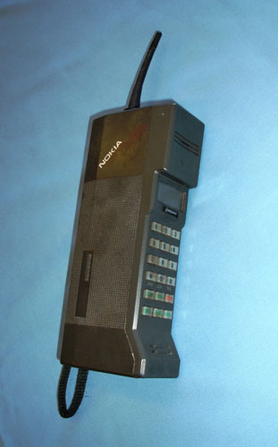
In 1987 this Nokia beauty was in the hand(S) of the rich weighing around 800g and was more portable than the Motorola 4500. 
 
 
It was Nokia that first saw the potential for mobile phones as fashion items rather than mere gadgets, recognising that the size and weight had to be more considered. 
In 1997 the Nokia 8110i was released, which featured in The Matrix. When the film came out in 1999, Nokia was ready with a new version of the phone, the 7110.

While most mobile phone companies were still offering bulky handsets, Motorola unveiled the ultra-slim RAZR phone in 2004, and it quickly became the must-have gadget of the mid noughties - and in a variety of colours!  I for one was the proud owner of this slick product.
 

In June 2007 the mobile phone industry was given a harsh wake-up call as Apple launched the iPhone. By the start of 2010 more than 3 billion apps had been downloaded by iPhone users across the world!

With this brief snapshot into the history of how mobile phones have developed in aesthetic, speed and size, it’s no wonder Apple have got it right and are continuing to be the favourite on the market ( iPhone 5 sold 5 million in the first 3 days of release, crazy stuff). 
 
 
It’s clear that much research went into not increasing screen size massively due to the average size of thumb size, hence why I struggled with the massive 4.8” screen of the Galaxy S3. The iPhone 5 is also lighter and quicker to access apps and online data! I for one am bought straight back in ... . So much so that my very own iPhone5 has been ordered this week.  “Why fix something that’s not broken?”


Again Apple, I’m sorry for not jumping on the bandwagon sooner!
 
 
Design
Images courtesy of Google images
www.sovibrant.co.uk


3 October 2012

Porsche Pavillion by HENN


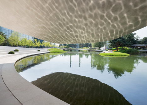
German Architects HENN have unveiled their beautifully sculptural Porsche Pavilion at the Autostadt theme park in Wolfsburg.


According to HENN, ‘curving lines and exciting bends make the Pavilion a dynamic yet reduced sculpture with its characteristics derived from the Porsche brand image. As designed by HENN, the structure captures the dynamic flow of driving with a seamless building skin. Its lines pick up speed and slow down just to plunge forward in large curves with ever-changing radii. The stainless steel cladding forms a flush envelope for this vibrant structure, creating the impression of a homogeneous unity, whilst creating a continuously changing appearance depending on light and weather conditions.’


Photos by HG Esch (follow this link - well worth a look)

Architecture and Design at SoVibrant

Related links:

Design Classic No.007: Aston Martin DB5 
Design Classic No.246: Ferrari Dino
Design Classic No.300: Mercedes 300SL Coupe
Design Classic No.325: Ferrari 512 S Modulo

1 October 2012

In A World Of 100....


"World Of 100" a new project form graphic designer Toby Ng explores the concept of what the composition of earth would look like if it was represented as a village of 100 people. The figures are beautifully expressed and simply illustrated drawing attention to some truly startling statistics. For example only 7% of the worlds population have a computer (so 93% wont even be able to read this blog) and only 52% are considered to live in a free society. The statistics illustrate the width of the gap between the haves and have-nots and show how far we still have to develop to become a truly global society.