FEATURED POSTS


John Lewis - The Bear and Hare - 2013 Seasonal CGI Amazing coloured pencil drawings Tokyo City Symphony Luis Nieves - Baywood Red Light

20 April 2013

Oblivion - Behind the scenes


Good morning readers. 

Visual effects are used in most movies these days and more often than not with the help of giant green or blue screen studios.  From huge cinematic sci-fi battles to  simple colour correction of footage visual effects are everywhere.


But how do you solve the problem of editing out all the unwanted blue and green screen when you have a fully reflective environment?......Simple... forget about all the modern technology and go back to using more traditional techniques.


Check out this featurette from the up and coming Tom Cruise movie Oblivion where they talk about overcoming the problems of filming a high reflective environment by taking a step back in time and using a more traditional approach.


Sovibrant / Media Productions

19 April 2013

Co-Axial World - Omega watches


Hello readers,

Welcome to another blog focusing on brand marketing. The company in question is the Swiss based luxury watch maker Omega. Famous for pioneering state of the art mechanical watchmaking since 1848, they are a company that has a rich history heavily associated with glamour, wealth, quality, exclusivity and finally not forgetting their trump card, 007. From Golden Eye in 1995 to the present day with Skyfall, Omega claim that James Bond has been saving the world with his most reliable and precise accomplice to hand. They are rightly proud of this partnership which will be highlighted later in this blog.

"Co-Axial world" produced by Tax Free Film and created by HMNS is an animation  for Omega's "Co-Axial technology." The plan is to look at the animation, discussing the concept and the motivation behind it compared to the actual design and finish of the resulting timepieces. 

Final Animation "Co-Axial world" for Omega by HMNS and Tax Free Film

What really stands out in this animation is the level of detail that has gone into the modelling, which can only be appreciated and noticed the more you watch it. From corner to corner wherever you look on screen, it is possible to see a precisely modeled and beautifully animated representation of the Co-Axial mechanism. What has been created by the guys at HMNS is incredible from the original concept to the final product. So much thought has been put into the creation of the world, a world that has cleverly used as many parts of the Omega watch design as possible. So by creating mechanisms that are complex yet beautiful, the creative team deserves credit for getting the balance and amount of the mechanics in the animation spot on. 

The team had to create models which were recognizable but that also showcased the design of Omega watches. The actual design process of deciding what parts of the watch to use for say the Mermaid and the Astronaut must have been both challenging and a lot of fun at the same time.  

Below is a collection of the development images for this piece from sketches to 3D model screen captures, which gives a sense of the through process that went into the concept.


Personal favourites are the use of the Omega watch face design  on the waves of the sea and the Yacht's sails, the design of the Lunar module and Lunar buggy. The most complete scene for me has to be the Solar System model finale which is just amazing. Maybe not obvious to most is how every theme in the animation represents a different range of watches offered by Omega from Constellation, Seamaster, De Ville and Speedmaster. The Aston Martin DB5, a car famously associated with James Bond also makes an appearance. Omega reminding us of their proud partnership with the iconic secret agent which is a nice subtle touch in the animation.


It's also worth mentioning the amazing lighting and texturing, which has a distinct Art Deco style adding to the quality and luxurious feel associated with Omega.

What is truly great about this animation is that it is such a simple and obvious concept executed extremely well. One that has subtle messages throughout highlighting the Omega time-piece range without directly telling  you. This animation successfully advertises the level of design, quality and engineering which can be found in an Omega watch even if they don't always choose to showcase it.

I look forward to hearing your opinions in this topic.

Thanks for reading.

Ryan Blackburn - Media Productions
www.sovibrant.co.uk


12 April 2013

The Making Of House La Invernada


Hi readers,

I just wanted to post up the link to the latest 'Making Of' from CGarchitect.com.

Final render - image courtesy of CGarchitect.com

This article is much more in depth than some of the previous 'Making Of' editions and also makes good use of a wide range of applications. 

I really love the mood the artist has managed to capture in this image. The contrast between the almost cold nature of the setting and the strong sunlight in the foreground leads to a great visual experience.

Global Illumination render - image courtesy of CGarchitect.com

The link the original 'Making of' article is below.

Click here for 'The Making of House La Invernada'


Happy reading.

Media productions
www.sovibrant.co.uk


2 April 2013

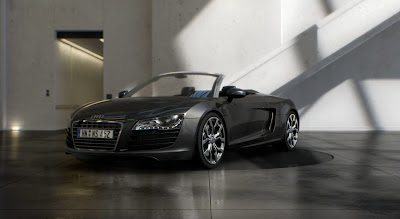
Audi's core values brought to life using CGI


Hi readers,

Today I would like to share with you a breakdown of Eyedream studios recent animation "Perfect Shadow" created for Audi's updated R8 Spyder. I am also going to have a look at how Audi commercials maintain a very distinct similarity and feel and try to explain some of the reasons behind this. So if you haven't seen the new animation then first you must watch the link below.

The new Audi R8 Spyder.

Perfect Shadow - Audi R8 Spyder Commercial 2013 from FUSE directors


So what did you think? Interesting, beautiful, confusing? In recent years Audi have been very clever with their approach to marketing their cars. Although they have a diverse target market, they have a range of cars to match. From everyday hatchbacks, executive saloons, luxury 4x4 to high end supercars, there is not a part of the automotive market that they do not have a car tailored for. So with every vehicle designed to meet a different set of needs, the importance of consistency achieved through use of brand becomes essential. Audi utilize a clearly recognizable visual style throughout their commercials to achieve this continuity. So let's see this style in practice? Below are a selection of commercials from across the Audi range which all utilize this consistency in style to reinforce the quality, excellence and exclusivity of Audi products . I may have got carried away with all the links but there are so many really great commercials that support the point I am trying to make.

 Audi A4 "Intelligently combined" 2009 Commercial

 
Audi R8 V10 2013 Commercial

 
Audi A1 "Millimeter" 2012 Commercial

  
"Audi Perfection" 2010 Commercial

   
Audi A6 2013 Commercial

 
Audi RS6 2008 Commercial


Audi A6 "Manipulation" 2010 Commercial

 
Audi A4 2010 Commercial

 
Audi A4 2000 Commercial

Reflective of Audi's own level of technical and design excellence, Audi describe their cars as "Beautifully engineered." This most descriptive part of Audi's brand value is intrinsic to their brand identity and can be seen in the selection of commercials through the clear emphasis on  attention to detail in the design and engineering of their vehicles. Audi's most famous strap-line "Vorsprung durch Technik", roughly translated means "Advantage through Technology". This emphasis on the fine balance between aesthetic and function is at the heart of the Audi brand and is further reiterated by Audi's use of the strap-line  "Innovation and Elegance".  

These are the core values that Audi live by and are at the heart of the product and lifestyle a consumer buys into. Audi don't sell cars, they sell a lifestyle, a fashion statement, a brand and membership to a exclusive club of Audi owners where style, good taste and excellence is simply assumed. 

Combining  advancements in CGI and strategically placed real life footage, Audi have been extremely clever in portraying this message.  

FUSE directors have recently released a break down of the new commercial "Perfect Shadow" created by Eyedream studios based in Paris as shown below. 

 
Breakdown of "Perfect Shadow" 2013 Commercial

This video shows the level of editing that went into each shot to get the final composition. Using Maya, Vray, Mental Ray, Nuke and After effects Audi were able to create an animation that is organic yet mechanical but one that also has a sculptural feel. By using CGI, this allows Audi to showcase the highly detailed and beautifully crafted components that go into all their vehicles. 


Although original in its concept, this animation still reflects the lifestyle, values and qualities Audi wish to portray and helps to create the required feelings of desirability. At no point do Audi focus on any aspect of technical performance because 0-60 times and engine size don't sell cars. Technical specifications open their cars up to comparison - they are levelers not differentiators. Audi promote the aspirational and intangible and play on people's desire for improved status. 


You can see more of Audi's work on their youtube channel.

I would love to hear your thoughts on this subject.

Thanks for reading.

Ryan Blackburn - Media Productions
www.sovibrant.co.uk