FEATURED POSTS


John Lewis - The Bear and Hare - 2013 Seasonal CGI Amazing coloured pencil drawings Tokyo City Symphony Luis Nieves - Baywood Red Light

31 May 2012

Silent World


In the photo series 'Silent World' Paris based artists 'Lucie & Simon' have created the rather chilling feeling of what the world would feel like if you were the last person on earth.
The series was created using natural density filters that enable extra long exposures and limit light entry without closing the aperture or increasing the shutter speed. This allows them to remove moving objects such as people and cars.
The picture are taken at many locations including Times Square in New York, Tiananmen Square in Beijing, and Place de l'Opera in Paris.
The curator of the series, Klaus Honnef states that the inclusion of the small intrusions give the series its impact as 'their disconcerting presence disrupts the majestic calm of the streets and squares. Are the latter guilty of victims?'


http://vimeo.com/lucieandsimon/silentworld

http://vimeo.com/lucieandsimon/silentworld


Architecture, Design and Film - 2001 Space Odyssey


In a new regular feature I thought it would be good to combine three popular SoVibrant subjects: Architecture, design and film. These three have always been closely linked in the creative world and none more so than in some of the most memorable blockbusters.

To start with, I have chosen 2001: A Space Odyssey, a 1968 science fiction film produced and directed by Stanley Kubrick.
Remarkably ahead of its time, and regarded as the most thoroughly and accurately researched films in screen history with respect to aerospace design, this is one of my favourites.

Kubrick involved himself in every aspect of production and set design, picking actors’ costumes and selecting notable pieces of contemporary furniture.
The most noted pieces of furniture in the film are the bright red Djinn Chairs by Olivier Mourgue, seen prominently throughout the Hilton Space Station.
Alongside these, are Eero Saarinen's 1956 pedestal tables, another famous piece of "modern" design.
Kubrick even chose cutlery designed by Arne Jacobsen, for the Discovery astronauts in the film.

The film went on to influence Steven Spielberg, George Lucas and Ridley Scott amongst others , who describes the film as unbeatable.


Images courtesy of Google Images

Architecture - Design - Film - 2001 Space Odyssey

28 May 2012

David Shrigley


Artist David Shrigley's latest exhibition in Manchester is to have comedian Harry Hill give tour guides later this year.

Shrigley, famed for his weekly cartoon in The Guardian Weekend magazine, depicts humorous yet often unnerving observations of the bizarre and inconsequential.

The Harry Hill tours will undoubtedly be brilliant. "I will be conducting a tour of his new stuff and trying to be funnier than him," Hill stated. "No mean feat."

The exhibition, at the Cornerhouse gallery, starts in October with the tours commencing in December.


Art at SoVibrant www.SoVibrant.co.uk

24 May 2012

Tweet Revenge


Over 50% of the UK's population admit to considering using social networks to exact their revenge.


The increase in users of Facebook and Twitter has made it much more simple to access a wider audience and people wanting to expediently settle scores. One in 10 people intimated that online networks are responsible for people's desire to get even.


More than half said they were thinking about using social networks to even things up however one in four declared they had already exacted their revenge through anger, jealousy or spite.
You may want to watch your back as work colleagues are the favoured target, closely followed by friends and bosses.


Adultery is the sin most deserving of revenge said one third of Brits, trailed by lying (19%) and theft (9%).


Statistics also showed that more than one in ten think that people in the public eye are fitting of abuse on social networks if they have done something wrong.


50% of the people interviewed believed that the majority of revenge takes place on Facebook. It is too much easier to type a quick message and sharing it with world than confronting someone face to face. 57% of people prefer to to take revenge online than in person.


The question we ask is, "Do we want to live in a society where immediate insult, personal ridicule and hate speech finds ready expression and even approval?"


www.sovibrant.co.uk
Identity

17 May 2012

Amazing cardboard artworks by Chris Gilmour


Check out these fantastic cardboard sculptures by Chris Gilmour:


Using only cardboard and glue, Gilmour creates these life-size artworks with painstaking attention to detail without any hidden, non-cardboard structures or trickery.


Gilmour was born in Stockport, UK but now resides and creates his works in Udini, Italy. I love the way he has been able to replicate the originals yet keep honesty to his material by retaining the raw feel and inherent monochrome finish. How he's managed to form subtle curves from a flat starting point is simply amazing. I wish these were my creations.


Art and Design at SoVibrant www.SoVibrant.co.uk

Images courtesy of Chris Gilmour - check out the full story of Chris and his creations here, plus  various 'work in progress' shots here


16 May 2012

The ArcelorMittal Orbit v The Statue of Liberty


Following up on my blog 2 years ago, aptly timed on the 1st April 2010, the new Folly for the Olympic Park has finally opened at a cost of £19.1 million.
The ArcelorMittal Orbit is now Britain's largest piece of public art, who's height has been described in comparison to the Statue of Liberty.
The finished steel sculpture is a 115 metres (377 ft) high with the Statue of Liberty being 93 metres (305 ft) high, when counting the 46 metres (151 ft) statue together with its pedestal.

Whether the tower was originally an April Fool's joke from Boris Johnson, or an inspired deal agreed with steel tycoon Lakshmi Mittal (who put up £16 million of required funds) is yours to decide.

However the Olympic Park, as I previously mentioned, would be lost without this thought provoking centrepiece, something the Olympic Stadium can never be described as.

Boris realised the Park needed something extra and along with Anish Kapoor, Cecil Balmond, and Arup Engineers, he has delivered the most memorable structure for the games and the on looking world TV audience.

The Orbit is a statement, but I did prefer the elegant approach of Santiago Calatrava's telecommunication tower, built for the 1992 Barcelona games.
This tower stands at 136 m (446 ft) tower is located in their Olympic park, and represents an athlete holding the Olympic Flame.

Perhaps the Orbit is a symbol of our country in 2012, chaotic, unstable and spiralling out of control. Let’s hope the games are as well organised as the engineers, who had to help deliver it on time.


Architecture, Sculpture and Design

Images courtesy of Google images.


11 May 2012

Mobil 60's Petrol Stations


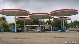
English Heritage have recently announced that two iconic sixties petrol stations are to be given listed building status.

The Mobil sites, at Markham Moor, Nottinghamshire, and Red Hill, Leicestershire, have canopies that "hark back to a time when driving was still an adventure".

John Minnis, of English Heritage, said the designs reflected the times. "Back in the beginning of the sixties motoring was still exciting, but somehow we began to fall out of love with the car," he said.

The full story can be found here

 Markham Moor

Red Hill

Design at SoVibrant www.SoVibrant.co.uk


10 May 2012

Designer Hot Tubs!


After some ridiculous news from my brother this week of a Hot Tub purchase at my Mum’s house (without her knowing OR her consent) I thought I would explore the possibilities of what I could be coming home to one night this week.

I’d like to say that my brother, Luke, has thought this through thoroughly, working out that the tub needs some serious structural support underneath, to not be put straight onto my Mum’s beautifully kept lawn and that it will be used in a responsible and adult way.  However, I already know that the harsh reality is that it’s been bought on a whim, with no thought and will possibly see over 50 visitors in the coming week. 

Without knowing a lot about the “hot tub” design world, I thought I’d explore what I hope to be coming home to...

Hot Tub 1 - Panacea

A beautifully designed hot tub with inspiration taken from the arctic surrounds.  I doubt this is the look Luke’s gone for though.


Hot Tub 2 - SPAmbient’s Luxema 8000  

A “slight” improvement on the bath-tub!! The whole structure has been divided into two different parts and boasts of an in-built bar and a flat-screen TV (because you NEED this in your hot tub). The first “part”- a six seater lower spa has a bar attached to the outside... should your guests feel thirsty. Washed down with glasses of summer drinks, your chums can make a splash at the pool, a cooling zone which forms the tub’s “mind blowing” other half. Powerful water jets create the effect of a current, the pool makes for an amazing luxury den, and just in case guests are not comfortable swimming against the current, the jest could always be turned off!!  I think Luke would be a little annoyed his missed out on this.


Hot Tub 3 - BISHTA

Apparently fibreglass shells, built in sound systems and TV screens are the latest requirements from the modern day hot tubs.  This particular range of tubs can range from £1000 - £15,000 (depending on specification).

232 Designs states: “Several hot tubs spas can seem to be like very cheap to buy however its always recommend to find out what are the running pricing is ” .... I’m sure my brother can’t have done this!


After the above research and the HOPE of wanting to come home to something beautifully designed and well thought of, however, I know I’m going to come home to this!!!


Design


Game of Thrones


Good afternoon readers. Today we bring you an inspiring animation from HBO's latest phenomenon, Game Of Thrones.


With several blockbuster series already under their belt, such as Band of Brothers and True Blood, HBO has set the standard for the mini-series. But putting the actual program aside, we are more interested in the amazing concept and visualization of the Intro sequence.

As the sequence starts the camera pans to an incredible world map in which cities are constructed and transformed from cogs, nuts and bolts… it’s an incredible in-depth introduction to a TV series but also shows the amount of work and concept design that has gone in to what is currently one of the biggest programs on American TV. 

View the video below to see this amazing sequence 
  

Game of Thrones has done so well that The Simpsons have created their own parody...to view it, follow the link below

http://collider.com/game-of-thrones-simpsons-couch-gag/150040/


SoVibrant / Media

Marvel's - The Avengers Assemble


Hi everyone,


Hot off the SoVibrant press! The Avengers is an amazing movie that everyone should go see!


Last night, a group of us SoVibranteers went to see this brilliant new movie.


We were a little apprehensive beforehand as there has been so much hype built up around the film and we didn't want to be disappointed. Fortunately it stood up to all of the hype and was as good, if not better, than we expected.


Below are a couple of quotes from the guys here at SoVibrant who saw it last night.


Mo Akhtar
"Absolutely amazing and stands up to all of the hype. The Incredible Hulk was an amazing character, I can't wait for the sequel!"


Adam Lay

"The hulk is by far the best character, smashing everything he gets his hands on. He is closely followed by Tony Stark for his comedy one liners. However, most of this can be outshone by the female roles where Scarlet Johansson, Gwyneth Paltro and Cobie Smulders pull off some amazing outfits!"


Peter Pringle
"Great fun! Comics aren’t really my thing but loved this film from start to finish (especially Scarlet Johansson)"


3D & Media

Proteigon


I thought I would share this amazing paper based stop motion animation I recently discovered from Steven Brand.

8 May 2012

SoVibrant's 3rd Birthday!


We are proud to announce that SoVibrant is officially 3 years old today!


As Managing Director and Founder of the business I am so proud of what we have achieved since 2009 when we set the business up, all the wonderful projects we have delivered, our outstanding management team and the fantastic team of designers and creatives that make it all  possible every day.

It was a dream since the age of 16 to see SoVibrant realised as a company and to see the success and strength of what we have created against all the odds, at a time of recession, when everything in the media has been relentless doom and gloom since the day we began is a great feeling and I am so proud of everyone I have the pleasure of working with on a day to day basis. From those who have been with us since day one, to our latest signings, it is the hard work that everyone puts in day after day that makes us the creative powerhouse that we have become.

We have already done something special together by getting this far and this is just the beginning. We have a fabulous platform for the future and we have lots of big plans. We have a great culture, great people, great clients and we have kept our ethics and integrity throughout the growth of our business. We truly believe in the strength and unique offering our business gives to the market place and are doing a great deal of work behind the scenes getting ready for the next ambitious stage of our plans.

We are delighted to be able to share such a momentous day with you all.

Adam Atkinson