FEATURED POSTS


John Lewis - The Bear and Hare - 2013 Seasonal CGI Amazing coloured pencil drawings Tokyo City Symphony Luis Nieves - Baywood Red Light

30 April 2010

High Flyers

For 350 euros a night how about a Hotel suite in a 120 seater plane from East Germany with Sauna, jacuzzi, 24/7 hostess, 3 flat screens and a Blu-Ray player.

Guests have access to the entire plane, from the king-size bed in the back all the way up to the Cold War era cockpit.

The clean, modern white interiors and luxury facilities installed by Dutch company Hotelsuites.nl give the plane a new lease of life.

Unfortunately, the plane stays grounded outside the Teuge airport in the Netherlands, so your chances of joining the mile high club are slim.

 Interior Design
www.sovibrant.co.uk

27 April 2010

Artist of the Week No.11 Shepard Fairey (AKA Obey)


Shepard Fairey began his career as a graffiti artist with the Obey Giant sticker campaign in 1989. His style is influenced by and forms a critique of both advertising and propaganda posters. 

He is now one of the most prolific and well-respected graffiti artists in the USA, famous for his politically charged images of consumer culture. 

To see more of Shepard Fairey's (Obey) work check out  www.obeygiant.com


  Graphic Design   |   www.sovibrant.co.uk

Worlds first CG School

Hi everyone,

Some very interesting news in the world of 3D visualisation! The first ever official school specifically taylored for visualisation training, has been formed by three of the powerhouses in the world of 3D.

3DATS + cgarchitects + Spine3D have formed the school to cater for a market that has been neglected for far too long.

Please take a look at the link below for the full low-down of the school and what it offers.

This is a very good step in the right direction towards raising the bar for 3D Visualisation.

Many thanks.

3D Visualisation
www.sovibrant.co.uk

26 April 2010

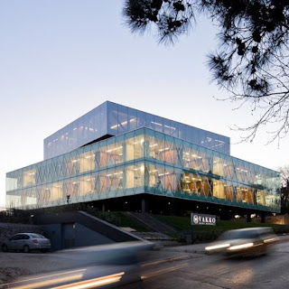
Vakko Fashion Center and Power Media Center

An American architecture firm has completed a project in Istanbul for two sister companies, Vakko fashion center and a television and radio company, Power Media. The building in Istanbul was created from an abandoned on site hotel project and is not only one building, but two.

The outer building was constructed from the existing concrete structure. The cladded glass exterior allows views to the inner building and is stacked full of mirrored boxes. The inner or second building houses an auditorium, showroom, meeting rooms and executive offices not to mention a huge amount of glass, steel and a myriad of mirrors. Although this building appears to be a work of art and clever piece of architecture, I’m not sure how anyone would be able to concentrate with such a busy interior concept!


Interior Design

23 April 2010

Artist of the week #10. Ryan Church

You might not know the name, But you will know the work. A Concept artist from Long Beach California with more motion pictures to his name than any other. Church started his carrier working in the imagineering department of Walt Disney Studio's as well as freelancing for Universal studios. After spending a few years there, he moved up in the world to Industrial Light and Magic working on such films as Star Wars Episode 2 & 3

Soon after, Church was offered a opportunity of a life time to become lead art director for Lucas Films at the SkyWalker Ranch. This led him to work on a whole range of blockbuster films including War Of The Worlds (2005), Transformers (2007), StarTrek (2009), Transformers II (2009) and most recently Avatar (2009). Not Bad for a guy who's not even reach the age of 40 yet.

To check out more of Ryan Church's work Visit. www.ryanchurch.com


3D Visualisation
www.sovibrant.co.uk

Cool Beans


The Qubik Coffee Bar is located in the Slovenian cultural and educational KB centre in Gorizia, Italy.
The bar occupies only 25 square metres and has two entrances, one from the city main road and one from the courtyard to the rear.
The most successful thing about this simple scheme is the way it links these two external spaces and takes the inside outside.
The long Corian counter becomes an extension that breaks through the two glazed facades and draws people into the space.
Creating a cube-shaped illuminated display on the street side that reminds me of a sugar cube and to the rear a functional suspended smoking area in the courtyard.
Sometimes good design comes in small packages and this is definitely a little gem.

22 April 2010

SoVibrant in Yorkshire Post....

SoVibrant were pleased to be mentioned in yesterday's Yorkshire Post in relation to the new Visitor Information Centre in York.


Due to open towards the end of May, the state-of-the-art Visitor Information Centre, designed by SoVibrant, will set a new trend in visitor experience, carefully contrasting modern fittings within a period environment:


SoVibrant Interior Design www.sovibrant.co.uk


The Ultimate In Inspiration

We thought we would take the time to tell you about the brilliant and inspirational publishers that are Ballistic.
Since 2003, Ballistic have showcased the finest in digital art work. There First Book, Expose1 was an instant hit within the creative design industry with interviews and master class's from artists within the film, game and broadcasting community.

Since then Ballistic have published a range of different books including D'artiste, Essence, Elemental and many more. which covers everything from traditional painting to 3D modeling and visualization, inspiring young artists and designers around the world to reach the full potential.

Check out there newly released book at     www.ballisticpublishing.com


 3D Visualisation
www.sovibrant.co.uk

21 April 2010

Too much?

"The ultimate show home for any individual crazy about art, architecture, interior design and sculpture"!
At first I wasn’t really sure what to think of this. To me it immediately looks overwhelming in so many different ways but after reading several articles about its character, and loving the interior far more than the exterior, I think I’m starting to appreciate it more. Have a look and see what you think.

The villa design by tecARCHITECTURE is a combination of forms and “AvantGarde” ideas, embellished by giant external images and filled with contemporary classics from the Wanders oeuvre. Casa Son Vida 1 is the first in a projected estate of six high-end villas, all of which vary wildly.

The villa consists of a basement library, office and cinema complex and is joined by a sauna and fitness. Above these, bedroom suites are located in the angular main house while living spaces are placed in the arc. A spectacular master suite is set right at the top of the structure, with private terrace and dressing area looking back across the sculptural forms of the arc. To complete the design, a snaking grand staircase reaching down from the main living areas invading the pool space.


Interior Design, Architecture, Graphics, Art

20 April 2010

3D visualisation of the week !

Hi everyone,

Please find attached another great visual, this time from artist Dan Dewald.

This image excellently captures the mood of a twilight setting with great use of contrasting blue hues and strong internal lighting. I especially like the way he has created the image as alomost duo-tone, with the exclusive use of yellows/oranges and blues. Dan's image contains a very simple use of lighting but really makes an impact with the mood it has managed to capture.

As with all of our weekly visualisation posts, please feel free to leave relevant comments and critiques. It would be nice to get a discussion going on how you all think this image may have been put together.

Enjoy.

3D Visualisation

19 April 2010

Beauty with function

Just a quick blog to show a great example of how a potentially awkward installation can be turned in to a thing of interest and beauty.

Surface-mounted cable trunking is ugly but to chase walls and ceilings to hide cables is costly and involves wet trades. Here the cable routes have been specifically designed to add an extra dimension to the scheme, celebrating them as a feature...


Sovibrant interior design www.sovibrant.co.uk


16 April 2010

Making it Big in Hollywood

Since 1923, the Hollywood sign has been a Los Angeles landmark, with its famous white letters welcoming aspiring movie stars, directors, and star-struck tourists to Tinseltown.

You may have noticed in the news that the world-famous sign is now in jeopardy of being obstructed by multi-million-dollar mansions.

Unless the city of Los Angeles raises enough money to buy back the land behind the sign from private investors who want to sell the prime real estate.

This latest plan calls for the famous letters to be enlarged to double the size, building them out from the back, allowing guests to stay inside the Hollywood sign itself.

The avant grade hotel would have rooms inside the letter, with the addition of observation decks for sweeping views over the city of Los Angeles.

The design is a good example of Brand Architecture, that respects the history of the famous landmark and its location.


Interior Design www.sovibrant.co.uk

15 April 2010

Artist of the week#9. Syd Mead

A legendary concept artist, Syd Mead began his career in the late 50's using traditional oil painting techniques to create styling concepts for Ford Motor Company. However, by the early 70's he had left the life of transport design to work on feature films where he pioneered the role of concept artist. Syd was thrown into the deep end and became one of the lead artists on the original Star trek from 1978. Since then Syd has given so much back to the design and motion picture community. He has produced numerous publications on his techniques in the industry as well as lecturing at many design studios around the world including The Gnomon Workshop in the heart of Hollywood.

Syd Meads' career of creating cinematic views of the future has stretched over 5 decades and to this day people still view his early work as futuristic. With digital creative technologies developing by the second Syd still prefers to use traditional techniques such as oil paints, which I am sure you will agree still look as fresh and striking as they would have done at any time during the last 50 years.

Find out more about Syd Mead at    http://www.sydmead.com/


Interior Design / http://www.sovibrant.co.uk/


Guerilla advertising...


A great way to build interest and buzz around a product, event, personality, organisation or brand can be the use of guerilla advertising campaigns.

There are some of the more clever examples below. Enjoy!


Child Poverty..


Real Hip Hop (Radio)


Mini Cooper


Nikon


Ikea (stair drawers)


Jobsintown


3M (security glass)