FEATURED POSTS


John Lewis - The Bear and Hare - 2013 Seasonal CGI Amazing coloured pencil drawings Tokyo City Symphony Luis Nieves - Baywood Red Light

31 March 2010

Divine Interventions

I've seen many a church conversion and restoration project featured on Grand Designs, but this one below is pretty special.
The Designers have given a Catholic church in Utrecht a new life as an exclusive private residence.
They have highlighted the original details - the stained glass windows, the organ, the archways and cross - by painting everything else white, which I both like and dislike at the same time.
From my previous blogs for Sovibrant, my colleagues clearly know my love of white interiors.
Here is another beautiful example, however this time they may have overdone it, with the new white floor.
Stone or timber would have been a better option, with original timber boards or a new limestone tiled ground floor.
This aside I'd love to live in this church building - the open plan, high ceilings and the mixture of old and new works beautifully.


Interior Design www.sovibrant.co.uk

Cool product - Spider Podium

Anyone who has an iphone, knows the issues associated with showing video to someone or watching a video longer than 30 secs. The iphone and its peers have no stands! So unless you hold it in your hand, it is impossible to keep your smartphone on mp3 player upright.  

Enter the Spider Podium... Your very own personal in dash GPS and movie player console. Holster your SatNav GPS on the dash of your car, hang your smartphone or movie player on the back of a train seat, holster your mp3 player on a plane tray table, dock your phone bedside in a hotel, even take it on the beach.

A nice product, well executed and a lot cooler than hanging a DVD player around the headrest of your car. ; )

30 March 2010

3D visualisation of the week !

Hi everyone,

Welcome back to our visualisation of the week post!

This weeks image is a little different but is technically a very good piece of 3D visualisation. The visual below was created by FoundationCGI.


This visual demonstrates a great attention to detail as well as cleverly added realism. This is achievent through all of the intentional inconsistencies and nuances in the modelling and texturing. Unfortunately, as we all know, in a commercial environment it is rarely possible to achieve such detailed results. That being said, this level of detail and realism is definitely the goal of any 3D visualiser.

Please feel free to comment on any of the techniques you think may have been used in the creation of the visual.


3D Visualisation
www.sovibrant.co.uk

Laneways Art Program 2010, Sydney

The City of Sydney seeks to support the development of new curatorial voices in the public domain to reinvent, rediscover and liven the City's laneways and forgotten spaces. The city’s backstreets are set to take on a new dimension, restoring historical and cultural significance to the city, an issue that was raised to Sydney council in 2008.

The Laneway Art Program Curator will help develop a curatorial theme and select up to eight artists or collaborative teams to develop high quality temporary laneway art projects in response to that theme. The art will be displayed and viewed in 20 different external areas along Laneways. This will relate to the past studies of ways to create visual interest, while at the same time understanding that too much intervention can diminish the character and organic growth of lanes.


Art
http://www.sovibrant.co.uk/

Artist of the week #7. Craig Ward

Craig Ward is a New York based typographer and illustrator who likes playing with words. He currently occupies a Senior Designer role at Grey in Manhattan, but prior to that he was in-house typographer for CHI & Partners in London. He continues to be represented on both sides of the Atlantic by Debut Art for whom he creates typographic treatments and illustrations for a variety of clients in advertising, design and publishing.

Craig constantly pushes the artistic side of typography, creating stunning works that range from the gritty and hard hitting to the sublime and the delicate.

Delivering branded interiors for some of the worlds largest organisations, artists like Craig inspire us in how we help companies communicate their message and push the boundaries with their brand.   

A few examples of Craig's work are shown below.


For more info on Craig check out his website @ http://www.wordsarepictures.co.uk/

29 March 2010

Welcome Adam Lay!

We welcome another member of the SoVibrant team on board this morning. After 3 weeks in Nepal enjoying altitude sickness and living on Pringles, Adam Lay joins our 3D and media team as a 3D visualisation artist.

With a background in transport design, product design and visualisation. Adam again brings another unique set of skills to our ever diversifying team.

We wish Adam all the best!!


www.sovibrant.co.uk

26 March 2010

Natural security

Like brambles, fences are rising rampantly around us.

This is what happens  when embroidery meets industrial fence. Hostility versus nature, industrial versus craft.

Interior Design  www.sovibrant.co.uk

Facade of the Week....


The Arab World Institute, Paris.

Designed in response to an architectural competition almost 30 years ago, Jean Nouvel's Arabic Institute includes one of my favourite facades.
Uncompromisingly rectangular, the huge south-facing garden courtyard wall has been described as a 60m 'Venetian blind', although its appearance is more Islamic in decorative terms, with a repeating metal motif set behind the glass creating a giant pierced sun-screen.
The motifs are actually 240 motor-controlled apertures, which act like camera diaphragms to create a brise soleil, controlling the light entering the building by reacting and adjusting every hour. The mechanism creates interior spaces with filtered light without allowing harmful rays through  to the books within.

Beautiful and practical.


Interior design www.sovibrant.co.uk


Container Homes


There are around 20 million shipping containers in the world and well over one million of these currently lie unused in stockpiles. A 'green' use for these is for them to be converted in to homes as they are extremely strong, modular building blocks. It makes sense to 'repurpose' these containers as it takes 95% less energy to turn them into homes and buildings than it is to recycle the steel in them.

Technologies are available to overcome insulation and condensation issues, enabling the creation of chalets, workshops, student flats and contemporary homes including pre-fab opportunities.


Interior design  www.sovibrant.co.uk

25 March 2010

White on Black

The images below are of a serviced office space called Face to Face by the office provider APBC Offices.
Situated in a congested area of Singapore, this project aims to provide a serviced office and meeting space that fulfils the emerging need for lifestyle-orientated workplaces.

The designers were interested in overturning some typical office conventions to create a new experience for its visitors, spanning Architecture, Interior Design and branding.

One approach was to de-familiarize the distinction of a reception counter by turning it into a…meeting table-cum-play table.

Here, a 10m long sculptural bar formed out of solid surface becomes a magnet for interaction and activity on a daily basis as well as during special functions.

The inclusion of human and animal silhouettes in the branding provide a quirky and playful sensibility in the reception and meeting rooms.

While routine activities such as collecting mail and conducting brief meetings have been considered to encourage maximal interaction with the Face to Face office.

Interior Design www.sovibrant.co.uk

Seed Cathedral - Winning UK pavilion design for Shanghai 2010

The UK Pavilion designed by competiton winner Thomas Heatherwick is to be composed of 60 000 thin, transparent, flexible rods, each at 7.5m in length. With such a supple structure, the rods will bend and sway in the slightest of breezes, creating the effect of hundreds of cilia. Inside each tube will be seeds, representing the UK’s incorporation of nature into everyday life. Due to the transparent nature of the extended rods, daylight will flood into the central room of the ‘Seed Cathedral’, whilst at night the exterior is designed to glow as the light filaments inside each tube begin to shine.

The inspiration for the UK pavilion came from Heatherwick's idea to focus on the capital cities within the UK along with the connection between them and the natural world.  The design has been taken further to have a 2d and 3d film constructed to explain the evolution of the 'Seed Cathedral' which will educate all Shanghai 2010 visitors.


Interior Design

23 March 2010

Amazing 3D tutorial & visuals

Hi everyone,

I just wanted to post this link to the Evermotion site which is currently hosting a brilliant 3D tutorial on creating some stunning interior visuals.

I was going to post the visuals as one of our "Visualisations of the week" but after finding this tutorial decided that it deserved a post of it's own.

Many thanksgo out to Evermotion and also a great deal of respect to Alfa Smyrna (the artist) for this tutorial, which really exposes exactly how he created such beautiful and realistic images.

http://www.evermotion.org/tutorials/show/7952/modeling-and-rendering-tutorial-by-alfa-smyrna

Many thanks from all the Sovibrant team! To share is to progress !

3D Visualisation
www.sovibrant.co.uk

22 March 2010

Artist of the week #6.Dave Kinsey

Currently living and working in Los Angeles, Dave Kinsey is widely known for his social commentary delivered through his portrayals of characters from the city streets. While the idea of using the urban landscape as a canvas remains a constant, he continues to show his fine art in galleries in Los Angeles, Paris and New York among others. He was recently invited to exhibit at the URBIS Museum in Manchester and has been featured in publications such as The New York Times, Lodown and Black Book.

If you haven't  checked out his work before Dave's own website  (www.davekinsey.com) is a good place to start.

Enjoy!

Graphic Design / www.sovibrant.co.uk


Blu Bar, Manchester. An infusion of light!

After a recent trip to Manchester’s Blu Bar, I feel it’s an interior space worth Blogging!

At night Blu shows off its variety of lighting which creates different ambiances throughout, one of my main fascinations of this place. The red colour lighting (which is used more than any other) gives the space it’s unique and charismatic look, the feature of Blu that lures people in from the street and is like no other. The restaurant is home to lots of different colour pendant lighting  that creates a calmer range of light and likely to be used more in the day during service.

The existing brick internal walls, dark stone bar and glass around the existing pillars all work in a harmonious and beautiful partnership together. It is evident that there were many aspects of this building that had to be kept therefore meaning any design had to work around this. Each area of the space has a small element of careful design, whether it be a slight change in floor level or finish or a range of light fittings and coloured light, everything will completely captivate you throughout the whole time you’re there.

A place definitely worth a visit!

Ceiling of the week...

The designers of Las Vegas's Beijing Noodle bar were bored with specifing Armstrong's 'Dune' tegular microlook 600mm square ceiling tiles....


interior design. www.sovibrant.co.uk

19 March 2010

Structural elegance and an artist apartment

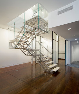
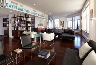
The images below are of a three thousand square foot duplex apartment renovation in a building on New York’s Upper West Side.

The design solution removed all existing vertical circulation and connected the two floors with a new feature stair, located centrally in the apartment, free from all walls and supported only at the top and bottom.

The clients, two art collectors with a keen interest in supporting emerging artists and designers. The Genetic Stair represents the culmination of a fully integrated generative design process.
The design team used advanced digital design techniques from the earliest conceptual stages, through performative analysis and onwards to fabrication.

Custom code was developed to marry the generative potential of 3D architectural modeling with the analytic power of structural design software.

The result was an automated evolutionary process in which populations of stairs were created in compliance with strict fabrication constraints and then rated for structural performance.
In the end, thousands of configurations were evaluated and modified before the final design was achieved.

Advanced digital fabrication techniques were combined with traditional metalworking expertise to meet the exacting design requirements of the digital model.
The stair embodies a restrained palette of polished stainless steel, white translucent Corian and low-iron glass.

Visualisation of the week !

Hi everyone,

Below is the next image chosen to take the lime-light as our 'Visualisation of the week'.

This image is from one of the visualisation forums we frequent but was just a link off the forum so I do not know the artist. If anyone does, please speak up, all credit goes out to his/her skill in this images creation.

The image cought my eye with simplicity, as well as its level of realism and careful us of detail in the foreground and in contrast a lack of real detail in the background. This is all brought together with a perfect example of Depth-Of-Field ( aka DoF). DoF is a very widely used technique but is rarely used in such a nice way.

I especially love the detail in the modelling of the rolled up Cad plans, the fraying of the edges to simulate the crumpled paper is simply genius.

All comments are welcome as usual. Also lets discuss how we think this image was created and the major techniques used.


Until our next installment, enjoy !!

3D Visualisation
www.sovibrant.co.uk

17 March 2010

Plug and play - we love this...

Here's a refreshing new look at an age old design, assumed by many to be a british standard not-to-be-tampered-with, that shows how improvements can be made to the most basic of objects.

 At only 10mm thick when stored, the Folding Plug by Min Kyu Choi is space efficient,  can be 'stacked' as a multi-way adaptor and even includes a @USB charger.


Interior design
www.sovibrant.co.uk